Alexis, Chandler, Kenna
1. Baskin Robbins
![]()
The font choice in the Baskin Robbins logo is playful and not in a straight line, much like the play-fullness of a child. With there only being 2 bright colors allows simplicity and for the hidden number 31 to stand out. The number 31 is there to show that they have 31 unique flavors of ice cream. Overall the logo is simplistic and playful.
2. Fedex
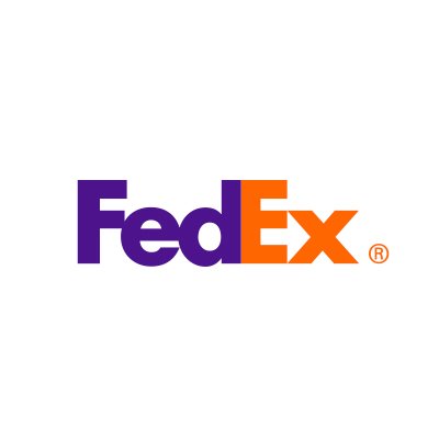
The font for FedEx is bold and box shaped which is fitting for a shipping company. FedEx has 2 colors to differentiate between the two words that they are short for, which are Federal Express. There is also a hidden arrow in the negative space between the E and x.
3. Beats
![]()
The beats logo uses more negative space than a specific font. The negative space looks like the letter b and also looks like a reverse half note, like from sheet music. Beats is also commonly associated with this vibrant red color, like a bright red beet.


Comments
Post a Comment